
 streamoors
 IGNITION
 Quantus
 Sui
Sui Pearl
Pearl Zcash
Zcash Aerodrome Finance

Gold has outperformed significant risk assets over the last three months. The Gold price has increased by 21% and the S&P 500 by 7% since August 11. On the other side, the Bitcoin price dropped by 15%.
The comparative charts affirm that the move itself is a breach of the relatively new crypto–equity relationship.
Major Stocks Show Steady Rise as Bitcoin Price Struggles
Examining comparison charts, we observe that the gold line exhibits a steady rise from September to October. This is holding most of the gains till November.
S&P 500 is also positive, but it has a less steep slope than gold. The trend reveals a late October pullback. The stock then recovered towards the beginning of November.
Bitcoin price trend lines decrease over time. Rallies and reversing turns mark the trail, but the general trend is downward. The decrease occurred between August 11 and the current date.
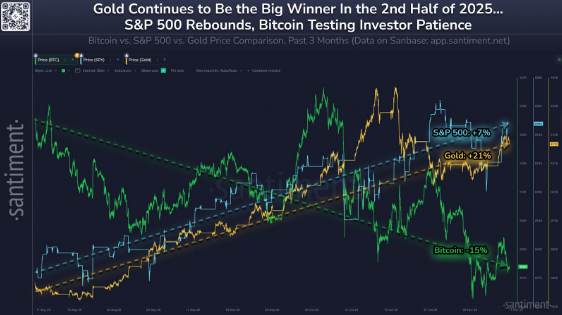
The three shows have the same timescale, which explains the timing of the divergence. The difference is highest in October, with gold continuing its upward trend, and Bitcoin registering a sharp drop.
As of early November, the spread has not been broken. This is because the markets have gold and the S&P 500 above their August level and Bitcoin below.
Gold vs. Bitcoin Ratio Tests a Multi-Year Line
The weekly GOLD/BTC ratio shows a clear downward trend. A single line connects the series of lower highs over time. The price has recently recovered to that line.
A circular marker has indicated the contact zone in the chart. The ratio is close to 0.040 on the right axis. The trend of the previous decline is also negative. However, recent developments in the ratio dispute this pattern.
A confirmed weekly close above the trend-line would be an indicator of a multi-year downward break. One of the stalls in the line would show that resistance has not been eliminated.
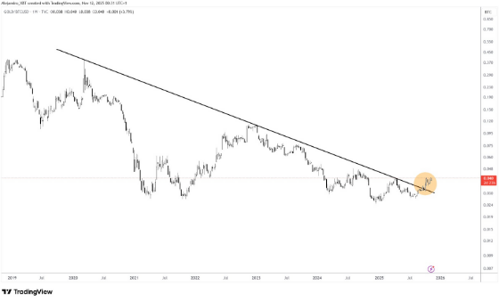
This three-month scorecard is directly connected to the ratio view. An increasing GOLD/BTC ratio is associated with the underperformance of gold and the relative strength of the Bitcoin price.
The ratio’s surge toward the long-term trendline is notable. It helps frame the move within a broader historical context.
Equity and Bitcoin Volatility Are Broadening
More charts show that the former is the E-mini S&P 500 futures, which has an expanding formation. There is the upper boundary that is tilted high and the lower boundary that is tilted low.
The pattern becomes more mature, and the bars swing around more widely. A short-term simple moving average is close to 6,934.5 on the right scale. The price is at 6,861.5 at the point of capture.
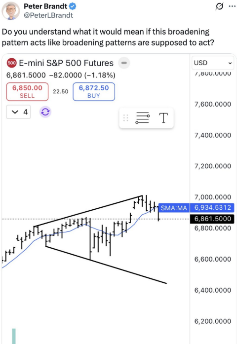
Widening structures usually indicate high volatility and sensitivity of the headline. Analysts described the arrangement as not a guarantee of the top, but one that requires respect.
The lesson is that both upside and downside whipsaws have been augmented in risk due to the expansion of the range.
The upper boundary and moving average level are two key references that traders use to monitor confirmation or failure. Charts show that price action has formed a megaphone pattern since July.
Highs and lows have continued to expand over time. The chart does not postulate that these levels are to be obtained. Instead, it plots the extent of recent fluctuations and the distance the pattern gives it in every direction.
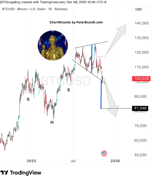
These perceptions supplement the three-month performance review. Equities performed better than Bitcoin during the period; however, they both currently exhibit expanding ranges. That combination is an indication of greater realized volatility in major risk assets.